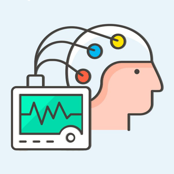
/* Fontes auto-hospedadas — substituem Google Fonts para melhor LCP */
@font-face {
  font-family: 'Inter';
  font-style: normal;
  font-weight: 400;
  font-display: swap;
  src: url('/fonts/Inter-400.woff2') format('woff2');
}
@font-face {
  font-family: 'Inter';
  font-style: normal;
  font-weight: 500;
  font-display: swap;
  src: url('/fonts/Inter-500.woff2') format('woff2');
}
@font-face {
  font-family: 'Inter';
  font-style: normal;
  font-weight: 600;
  font-display: swap;
  src: url('/fonts/Inter-600.woff2') format('woff2');
}
@font-face {
  font-family: 'Plus Jakarta Sans';
  font-style: normal;
  font-weight: 600;
  font-display: swap;
  src: url('/fonts/PlusJakartaSans-600.woff2') format('woff2');
}
@font-face {
  font-family: 'Plus Jakarta Sans';
  font-style: normal;
  font-weight: 700;
  font-display: swap;
  src: url('/fonts/PlusJakartaSans-700.woff2') format('woff2');
}
@font-face {
  font-family: 'Plus Jakarta Sans';
  font-style: normal;
  font-weight: 800;
  font-display: swap;
  src: url('/fonts/PlusJakartaSans-800.woff2') format('woff2');
}

/*
 * ============================================================
 * CASA DA MENTE — Design System v1.0
 * EEG & Polissonografia | Niterói e Madureira, RJ
 * ============================================================
 *
 * Arquivo: public/css/style.css
 * Usado por: /eeg, /eegnit, /eegmad, /eeginfantil, /psg
 *
 * Arquitetura:
 *  1. Design Tokens (CSS Custom Properties)
 *  2. Reset & Base
 *  3. Typography
 *  4. Layout Utilities
 *  5. Component: Header
 *  6. Component: Hero
 *  7. Component: Trust Bar
 *  8. Component: Cards de Serviço
 *  9. Component: Prova Social
 * 10. Component: Localização
 * 11. Component: FAQ Accordion (CSS-only)
 * 12. Component: CTA Final
 * 13. Component: Footer
 * 14. Component: WhatsApp FAB (Floating Action Button)
 * 15. Utilities & Helpers
 * 16. Media Queries
 * ============================================================
 */


/* ============================================================
   1. DESIGN TOKENS — CSS Custom Properties
   ============================================================ */

:root {

  /* --- Cores Primárias --- */
  --color-primary:        #1B6B3A;   /* Verde médico profundo — identidade principal */
  --color-primary-dark:   #134E2B;   /* Hover e estados ativos */
  --color-primary-light:  #2D8B52;   /* Links e destaques leves */

  /* --- Superfícies --- */
  --color-bg:             #FFFFFF;   /* Fundo principal — branco puro */
  --color-bg-alt:         #FAFAFA;   /* Fundo alternado para seções */
  --color-surface:        #F0FBF4;   /* Cards e painéis verdes suaves */
  --color-surface-hover:  #E3F5E9;   /* Hover em cards */
  --color-border:         #D1E8D8;   /* Bordas sutis verdes */
  --color-border-light:   #EDF7F0;   /* Bordas mínimas */

  /* --- Acento Dourado (discreto, evoca logo) --- */
  --color-gold:           #8B6820;   /* Dourado âmbar — WCAG AA 5.12:1 sobre branco */
  --color-gold-light:     #F5E6C0;   /* Fundo dourado suave */
  --color-gold-dark:      #6B4F14;   /* Hover do dourado — WCAG AA 7.63:1 sobre gold-light */

  /* --- CTA WhatsApp --- */
  --color-whatsapp:       #1B7A3E;   /* Verde WhatsApp — WCAG AA 5.38:1 sobre branco */
  --color-whatsapp-dark:  #155E30;   /* Hover do botão WhatsApp */
  --color-whatsapp-text:  #FFFFFF;   /* Texto sobre WhatsApp */

  /* --- Texto --- */
  --color-text:           #1A1A2E;   /* Texto principal — quase preto azulado */
  --color-text-secondary: #4A5568;   /* Texto secundário — cinza médio */
  --color-text-muted:     #595959;   /* Texto discreto — WCAG AA ~5.5:1 sobre branco */
  --color-text-inverse:   #FFFFFF;   /* Texto sobre fundo escuro */
  --color-text-on-primary:#FFFFFF;   /* Texto sobre primary */

  /* --- Feedback --- */
  --color-success:        #1B6B3A;
  --color-star:           #F6B000;   /* Estrelas de avaliação */

  /* --- Sombras --- */
  --shadow-xs:  0 1px 3px rgba(27, 107, 58, 0.08);
  --shadow-sm:  0 2px 8px rgba(27, 107, 58, 0.10);
  --shadow-md:  0 4px 16px rgba(27, 107, 58, 0.12);
  --shadow-lg:  0 8px 32px rgba(27, 107, 58, 0.14);
  --shadow-xl:  0 16px 48px rgba(27, 107, 58, 0.16);
  --shadow-cta: 0 4px 20px rgba(37, 211, 102, 0.45); /* Sombra verde WhatsApp */

  /* --- Tipografia — Famílias --- */
  --font-heading: 'Plus Jakarta Sans', 'Inter', Arial, sans-serif;
  --font-body:    'Inter', 'Plus Jakarta Sans', Arial, sans-serif;
  --font-mono:    'Courier New', Courier, monospace;

  /* --- Tipografia — Tamanhos (escala mobile-first) --- */
  --text-xs:   0.75rem;    /* 12px */
  --text-sm:   0.875rem;   /* 14px */
  --text-base: 1rem;       /* 16px — mínimo corpo */
  --text-md:   1.125rem;   /* 18px */
  --text-lg:   1.25rem;    /* 20px */
  --text-xl:   1.5rem;     /* 24px */
  --text-2xl:  1.875rem;   /* 30px */
  --text-3xl:  2.25rem;    /* 36px */
  --text-4xl:  2.75rem;    /* 44px */
  --text-5xl:  3.25rem;    /* 52px */

  /* --- Tipografia — Pesos --- */
  --weight-regular: 400;
  --weight-medium:  500;
  --weight-semibold:600;
  --weight-bold:    700;
  --weight-extrabold:800;

  /* --- Tipografia — Line Heights --- */
  --leading-tight:  1.15;
  --leading-snug:   1.3;
  --leading-normal: 1.5;
  --leading-relaxed:1.65;

  /* --- Espaçamentos (escala 4px) --- */
  --space-1:   0.25rem;   /*  4px */
  --space-2:   0.5rem;    /*  8px */
  --space-3:   0.75rem;   /* 12px */
  --space-4:   1rem;      /* 16px */
  --space-5:   1.25rem;   /* 20px */
  --space-6:   1.5rem;    /* 24px */
  --space-8:   2rem;      /* 32px */
  --space-10:  2.5rem;    /* 40px */
  --space-12:  3rem;      /* 48px */
  --space-16:  4rem;      /* 64px */
  --space-20:  5rem;      /* 80px */
  --space-24:  6rem;      /* 96px */

  /* --- Border Radius --- */
  --radius-sm:   4px;
  --radius-md:   8px;
  --radius-lg:   12px;
  --radius-xl:   16px;
  --radius-2xl:  24px;
  --radius-full: 9999px;

  /* --- Transições --- */
  --transition-fast: 150ms ease;
  --transition-base: 250ms ease;
  --transition-slow: 400ms ease;

  /* --- Layout --- */
  --container-max:  1120px;
  --container-pad:  var(--space-4);  /* 16px padding lateral mobile */
  --header-height:  64px;

  /* --- Tap Target mínimo WCAG --- */
  --tap-min: 48px;
}


/* ============================================================
   2. RESET & BASE
   ============================================================ */

html, body {
  overflow-x: hidden !important;
  max-width: 100vw !important;
  width: 100% !important;
}

*,
*::before,
*::after {
  box-sizing: border-box;
  margin: 0;
  padding: 0;
  min-width: 0;
  max-width: 100%;
}

/* Exceções necessárias — elementos que precisam ter tamanho próprio */
img, video, svg, picture { max-width: 100%; }

html {
  font-size: 16px;
  scroll-behavior: smooth;
  -webkit-text-size-adjust: 100%;
  text-size-adjust: 100%;
}

body {
  font-family: var(--font-body);
  font-size: var(--text-base);
  line-height: var(--leading-relaxed);
  color: var(--color-text);
  background-color: var(--color-bg);
  -webkit-font-smoothing: antialiased;
  -moz-osx-font-smoothing: grayscale;
}

img,
picture,
video,
canvas {
  display: block;
  max-width: 100%;
}

svg {
  max-width: 100%;
  /* SVG permanece inline por padrão — display: block só quando necessário */
}

input,
button,
textarea,
select {
  font: inherit;
}

p,
h1,
h2,
h3,
h4,
h5,
h6 {
  overflow-wrap: break-word;
}

a {
  color: var(--color-primary);
  text-decoration: none;
  transition: color var(--transition-fast);
}

a:hover {
  color: var(--color-primary-dark);
}

ul,
ol {
  list-style: none;
}

button {
  cursor: pointer;
  border: none;
  background: none;
}

/* Focus visible para acessibilidade */
:focus-visible {
  outline: 3px solid var(--color-primary);
  outline-offset: 2px;
  border-radius: var(--radius-sm);
}


/* ============================================================
   3. TYPOGRAPHY
   ============================================================ */

h1, h2, h3, h4, h5, h6 {
  font-family: var(--font-heading);
  font-weight: var(--weight-bold);
  line-height: var(--leading-tight);
  color: var(--color-text);
}

h1 { font-size: var(--text-2xl); font-weight: var(--weight-extrabold); }
h2 { font-size: var(--text-xl); }
h3 { font-size: var(--text-lg); }
h4 { font-size: var(--text-md); }
h5 { font-size: var(--text-base); }
h6 { font-size: var(--text-sm); }

p {
  font-size: var(--text-base);
  line-height: var(--leading-relaxed);
  color: var(--color-text-secondary);
}

.text-lead {
  font-size: var(--text-md);
  line-height: var(--leading-relaxed);
  color: var(--color-text-secondary);
}

.text-small {
  font-size: var(--text-sm);
  color: var(--color-text-muted);
}

.text-primary { color: var(--color-primary); }
.text-gold    { color: var(--color-gold); }
.text-white   { color: var(--color-text-inverse); }
.text-center  { text-align: center; }
.text-bold    { font-weight: var(--weight-bold); }

/* Destaque inline em verde */
.highlight {
  color: var(--color-primary);
  font-weight: var(--weight-semibold);
}

/* Badge texto dourado */
.text-gold-accent {
  color: var(--color-gold);
  font-weight: var(--weight-semibold);
}


/* ============================================================
   4. LAYOUT UTILITIES
   ============================================================ */

.container {
  width: 100%;
  max-width: var(--container-max);
  margin-inline: auto;
  padding-inline: var(--container-pad);
}

.section {
  padding-block: var(--space-12);
}

.section--alt {
  background-color: var(--color-bg-alt);
}

.section--green {
  background-color: var(--color-surface);
}

.section--dark {
  background-color: var(--color-primary);
  color: var(--color-text-inverse);
}

.section--dark h2,
.section--dark h3,
.section--dark p {
  color: var(--color-text-inverse);
}

/* Grid helpers */
.grid {
  display: grid;
  gap: var(--space-6);
}

.grid-2 { grid-template-columns: repeat(2, 1fr); }
.grid-3 { grid-template-columns: repeat(3, 1fr); }
.grid-4 { grid-template-columns: repeat(4, 1fr); }

/* Flex helpers */
.flex       { display: flex; }
.flex-col   { flex-direction: column; }
.flex-wrap  { flex-wrap: wrap; }
.items-center    { align-items: center; }
.justify-center  { justify-content: center; }
.justify-between { justify-content: space-between; }
.gap-2  { gap: var(--space-2); }
.gap-4  { gap: var(--space-4); }
.gap-6  { gap: var(--space-6); }
.gap-8  { gap: var(--space-8); }

/* Spacing helpers */
.mt-4  { margin-top: var(--space-4); }
.mt-6  { margin-top: var(--space-6); }
.mt-8  { margin-top: var(--space-8); }
.mb-4  { margin-bottom: var(--space-4); }
.mb-6  { margin-bottom: var(--space-6); }
.mb-8  { margin-bottom: var(--space-8); }

/* Section header pattern */
.section-label {
  display: inline-block;
  font-size: var(--text-xs);
  font-weight: var(--weight-bold);
  letter-spacing: 0.1em;
  text-transform: uppercase;
  color: var(--color-primary);
  background-color: var(--color-surface);
  border: 1px solid var(--color-border);
  padding: var(--space-1) var(--space-3);
  border-radius: var(--radius-full);
  margin-bottom: var(--space-3);
}

.section-title {
  font-size: var(--text-2xl);
  font-weight: var(--weight-extrabold);
  color: var(--color-text);
  line-height: var(--leading-tight);
  margin-bottom: var(--space-4);
}

.section-subtitle {
  font-size: var(--text-md);
  color: var(--color-text-secondary);
  line-height: var(--leading-relaxed);
  max-width: 60ch;
}

/* Divider */
.divider {
  width: 48px;
  height: 3px;
  background: linear-gradient(90deg, var(--color-primary), var(--color-gold));
  border-radius: var(--radius-full);
  margin-block: var(--space-4);
}

.divider--center {
  margin-inline: auto;
}


/* ============================================================
   5. COMPONENT: HEADER
   ============================================================

   Estrutura HTML:
   <header class="site-header" role="banner">
     <div class="container">
       <div class="site-header__inner">
         <a href="/" class="site-header__logo">
           <img src="/images/logo.png" alt="Casa da Mente" width="140" height="40" loading="eager">
         </a>
         <div class="site-header__actions">
           <a href="tel:+5521987549197" class="site-header__tel" aria-label="Ligar para Casa da Mente">
             <svg ...></svg>
             (21) 98754-9197
           </a>
           <a href="https://wa.me/5521987549197?text=..." class="btn btn--whatsapp btn--sm"
              target="_blank" rel="noopener" aria-label="Agendar pelo WhatsApp">
             <svg ...></svg>
             Agendar
           </a>
         </div>
       </div>
     </div>
   </header>
   ============================================================ */

.site-header {
  position: sticky;
  top: 0;
  z-index: 100;
  height: var(--header-height);
  background-color: var(--color-bg);
  border-bottom: 1px solid var(--color-border-light);
  box-shadow: var(--shadow-xs);
}

.site-header__inner {
  display: flex;
  align-items: center;
  justify-content: space-between;
  height: var(--header-height);
  gap: var(--space-4);
}

.site-header__logo {
  display: flex;
  align-items: center;
  flex-shrink: 0;
}

.site-header__logo img {
  height: 36px;
  width: auto;
}

.site-header__actions {
  display: flex;
  align-items: center;
  gap: var(--space-3);
}

.site-header__tel {
  display: none; /* visível em desktop */
  align-items: center;
  gap: var(--space-2);
  font-size: var(--text-sm);
  font-weight: var(--weight-semibold);
  color: var(--color-text);
  text-decoration: none;
  min-height: var(--tap-min);
  padding-inline: var(--space-2);
  border-radius: var(--radius-md);
  transition: color var(--transition-fast);
}

.site-header__tel:hover {
  color: var(--color-primary);
}

.site-header__tel svg {
  width: 18px;
  height: 18px;
  color: var(--color-primary);
  flex-shrink: 0;
}


/* ============================================================
   6. COMPONENT: BUTTONS
   ============================================================ */

.btn {
  display: inline-flex;
  align-items: center;
  justify-content: center;
  gap: var(--space-2);
  min-height: var(--tap-min);
  padding: var(--space-3) var(--space-6);
  border-radius: var(--radius-lg);
  font-family: var(--font-heading);
  font-size: var(--text-base);
  font-weight: var(--weight-bold);
  line-height: 1;
  text-decoration: none;
  white-space: nowrap;
  cursor: pointer;
  border: 2px solid transparent;
  transition:
    background-color var(--transition-fast),
    border-color var(--transition-fast),
    box-shadow var(--transition-fast),
    transform var(--transition-fast);
}

.btn:active {
  transform: scale(0.98);
}

/* Botão primário — verde da marca */
.btn--primary {
  background-color: var(--color-primary);
  color: var(--color-text-on-primary);
  border-color: var(--color-primary);
}

.btn--primary:hover,
.btn--primary:focus-visible {
  background-color: var(--color-primary-dark);
  border-color: var(--color-primary-dark);
  color: var(--color-text-on-primary);
  box-shadow: var(--shadow-md);
}

/* Botão WhatsApp — o CTA principal */
.btn--whatsapp {
  background-color: var(--color-whatsapp);
  color: var(--color-whatsapp-text);
  border-color: var(--color-whatsapp);
  box-shadow: var(--shadow-cta);
}

.btn--whatsapp:hover,
.btn--whatsapp:focus-visible {
  background-color: var(--color-whatsapp-dark);
  border-color: var(--color-whatsapp-dark);
  color: var(--color-whatsapp-text);
  box-shadow: 0 6px 28px rgba(37, 211, 102, 0.55);
  transform: translateY(-1px);
}

/* Botão outline */
.btn--outline {
  background-color: transparent;
  color: var(--color-primary);
  border-color: var(--color-primary);
}

.btn--outline:hover {
  background-color: var(--color-surface);
}

/* Botão outline sobre fundo escuro */
.btn--outline-white {
  background-color: transparent;
  color: var(--color-text-inverse);
  border-color: rgba(255, 255, 255, 0.6);
}

.btn--outline-white:hover {
  background-color: rgba(255, 255, 255, 0.1);
  border-color: var(--color-text-inverse);
  color: var(--color-text-inverse);
}

/* Tamanhos */
.btn--sm {
  min-height: 40px;
  padding: var(--space-2) var(--space-4);
  font-size: var(--text-sm);
  border-radius: var(--radius-md);
}

.btn--lg {
  min-height: 56px;
  padding: var(--space-4) var(--space-8);
  font-size: var(--text-lg);
  border-radius: var(--radius-xl);
}

.btn--xl {
  min-height: 64px;
  padding: var(--space-5) var(--space-10);
  font-size: var(--text-xl);
  border-radius: var(--radius-xl);
}

.btn--full {
  width: 100%;
}

.btn svg {
  width: 20px;
  height: 20px;
  flex-shrink: 0;
}

.btn--lg svg,
.btn--xl svg {
  width: 24px;
  height: 24px;
}


/* ============================================================
   7. COMPONENT: HERO SECTION
   ============================================================

   Estrutura HTML:
   <section class="hero" aria-label="[Nome do exame] em [Localidade]">
     <div class="container">
       <div class="hero__inner">
         <div class="hero__content">
           <div class="hero__badge">
             <img src="/images/selo-google.png" alt="5.0 estrelas — 546 avaliações no Google"
                  width="180" height="48" loading="eager">
           </div>
           <h1 class="hero__title">
             Eletroencefalograma (EEG)<br>
             em <span class="highlight">Niterói | Icaraí</span>
             <span class="hero__title-detail">Laudo em 24h</span>
           </h1>
           <p class="hero__subtitle">
             Procurando onde fazer EEG em Niterói?
             Na Casa da Mente você agenda pelo WhatsApp,
             faz o exame com conforto e recebe o laudo em 24h.
           </p>
           <div class="hero__trust">
             <span class="hero__trust-item">
               <svg ...></svg> Laudo em 24h
             </span>
             <span class="hero__trust-item">
               <svg ...></svg> RQE Registrado
             </span>
             <span class="hero__trust-item">
               <svg ...></svg> Sem Plano de Saúde
             </span>
           </div>
           <div class="hero__cta">
             <a href="https://wa.me/..." class="btn btn--whatsapp btn--xl"
                target="_blank" rel="noopener">
               <svg ...></svg>
               Agendar pelo WhatsApp
             </a>
             <p class="hero__cta-note">Resposta rápida — atendimento 7 dias</p>
           </div>
         </div>
         <div class="hero__image">
           <picture>
             <source srcset="/images/recepcao.webp" type="image/webp">
             <img src="/images/recepcao.jpg"
                  alt="Recepção da Clínica Casa da Mente em Niterói"
                  width="560" height="480"
                  loading="eager" decoding="async"
                  class="hero__img">
           </picture>
         </div>
       </div>
     </div>
   </section>
   ============================================================ */

/* ── HERO SECTION ── */

.hero__wrap {
  display: block;
  width: 100%;
}

.hero {
  background: var(--color-bg);
  overflow: hidden;
}

/* Imagem full-width — sem container, ocupa 100% da tela */
.hero__visual {
  position: relative;
  width: 100%;
  height: 58vw;
  min-height: 240px;
  max-height: 480px;
  overflow: hidden;
}

.hero__img {
  width: 100%;
  height: 100%;
  object-fit: cover;
  object-position: center 25%;
  display: block;
}

/* Gradiente na base da imagem — faz a transição para o conteúdo */
.hero__visual::after {
  content: '';
  position: absolute;
  bottom: 0;
  left: 0;
  right: 0;
  height: 50%;
  background: linear-gradient(
    to bottom,
    transparent 0%,
    rgba(27, 107, 58, 0.15) 100%
  );
  pointer-events: none;
}

/* Conteúdo abaixo da imagem */
.hero__content {
  display: flex;
  flex-direction: column;
  gap: var(--space-4);
  padding-top: var(--space-4);
  padding-bottom: var(--space-6);
  min-width: 0;
  width: 100%;
}

.hero__title {
  font-family: var(--font-heading);
  font-size: var(--text-2xl);
  font-weight: var(--weight-extrabold);
  line-height: var(--leading-tight);
  color: var(--color-text);
  word-break: break-word;
  overflow-wrap: break-word;
}

.hero__title .highlight {
  color: var(--color-primary);
}

.hero__title-detail {
  display: block;
  font-size: var(--text-md);
  font-weight: var(--weight-semibold);
  color: var(--color-gold);
  margin-top: var(--space-1);
}

.hero__subtitle {
  font-size: var(--text-md);
  line-height: var(--leading-relaxed);
  color: var(--color-text-secondary);
  word-break: break-word;
  overflow-wrap: break-word;
}

/* Mini badges de trust no hero */
.hero__trust {
  display: flex;
  flex-wrap: wrap;
  gap: var(--space-2);
}

.hero__trust-item {
  display: inline-flex;
  align-items: center;
  gap: var(--space-1);
  font-size: var(--text-sm);
  font-weight: var(--weight-semibold);
  color: var(--color-primary);
  background-color: var(--color-surface);
  border: 1px solid var(--color-border);
  padding: var(--space-1) var(--space-3);
  border-radius: var(--radius-full);
  white-space: nowrap;
}

.hero__trust-item svg {
  width: 14px;
  height: 14px;
  flex-shrink: 0;
}

.hero__cta {
  display: flex;
  flex-direction: column;
  gap: var(--space-2);
  width: 100%;
}

.hero__cta-btns {
  display: flex;
  flex-direction: column;
  gap: var(--space-3);
  width: 100%;
}

@media (min-width: 600px) {
  .hero__cta-btns {
    flex-direction: row;
  }
  .hero__cta-btns .btn {
    flex: 1;
  }
}

.hero__cta-note {
  font-size: var(--text-sm);
  color: var(--color-text-muted);
  font-style: italic;
  margin: 0;
  text-align: center;
}

/* Botão telefone — mesma cor do WhatsApp */
.btn--phone {
  background-color: var(--color-whatsapp);
  color: #fff;
  border-color: var(--color-whatsapp);
}

.btn--phone:hover,
.btn--phone:focus-visible {
  background-color: var(--color-whatsapp-dark);
  border-color: var(--color-whatsapp-dark);
}

/* Texto some no hover do botão telefone */
.btn--phone .btn__text {
  display: inline-block;
  max-width: 240px;
  overflow: hidden;
  white-space: nowrap;
  opacity: 1;
  transition: max-width 0.35s ease, opacity 0.25s ease;
}

.btn--phone:hover .btn__text,
.btn--phone:focus-visible .btn__text {
  max-width: 0;
  opacity: 0;
}

/* Manter compatibilidade com hero__image legado se existir */
.hero__image { display: none; }
.hero__inner { display: contents; }
.hero__badge { display: none; }

/* ── Rating Strip — estilo banana, full-width ── */
.rating-strip {
  display: flex;
  flex-direction: row;
  align-items: center;
  justify-content: center;
  gap: clamp(48px, 12vw, 160px);
  width: 100%;
  background: linear-gradient(90deg, #f0fbf4 0%, #e8f5ee 100%);
  border-bottom: 2px solid var(--color-primary);
  padding: 10px 16px;
  gap: 8px;
  overflow: hidden;
}

.rating-strip__left {
  display: flex;
  flex-direction: column;
  gap: 2px;
  flex-shrink: 0;
}

.rating-strip__stars {
  color: #F6B000;
  font-size: 20px;
  letter-spacing: 2px;
  line-height: 1;
  white-space: nowrap;
}

.rating-strip__count {
  font-size: 12px;
  color: var(--color-text-secondary);
  font-weight: 500;
  white-space: nowrap;
  display: flex;
  align-items: center;
  gap: 4px;
}

.rating-strip__right {
  display: flex;
  flex-direction: row;
  align-items: center;
  gap: 24px;
  flex-shrink: 0;
}

.rating-strip__label {
  font-family: var(--font-heading);
  font-size: 22px;
  font-weight: 800;
  color: var(--color-primary);
  white-space: nowrap;
  letter-spacing: -0.5px;
  line-height: 1;
  align-self: center;
}

/* Selo circular estilo certificado */
.rating-strip__seal {
  width: 60px;
  height: 60px;
  border-radius: 50%;
  background: var(--color-primary);
  border: 3px solid var(--color-gold);
  display: flex;
  align-items: center;
  justify-content: center;
  flex-shrink: 0;
  position: relative;
}

.rating-strip__seal::before {
  content: '';
  position: absolute;
  inset: 4px;
  border-radius: 50%;
  border: 1px dashed rgba(255,255,255,0.5);
}

.rating-strip__seal-inner {
  display: flex;
  flex-direction: column;
  align-items: center;
  justify-content: center;
  color: #fff;
  text-align: center;
  gap: 1px;
  padding: 2px;
}

.rating-strip__seal-inner svg {
  color: var(--color-gold);
}

.rating-strip__seal-inner span {
  font-size: 7px;
  font-weight: 700;
  font-family: var(--font-heading);
  text-transform: uppercase;
  letter-spacing: 0.3px;
  line-height: 1.1;
  color: #fff;
}

/* ── Badge de qualificação Google ── */
.hero__google-badge {
  display: flex;
  margin-bottom: var(--space-3);
}

.hero__google-badge-inner {
  display: inline-flex;
  align-items: center;
  gap: var(--space-3);
  background: #fff;
  border: 1px solid #e0e0e0;
  border-radius: 12px;
  padding: 12px 16px;
  box-shadow: 0 2px 8px rgba(0,0,0,0.08);
}

.hero__google-logo {
  display: flex;
  align-items: center;
  gap: 6px;
  font-family: var(--font-heading);
  font-size: 15px;
  font-weight: 700;
  color: #5F6368;
  padding-right: var(--space-3);
  border-right: 1px solid #e0e0e0;
  line-height: 1;
}

.hero__google-logo svg { display: block; }

.hero__google-rating {
  display: flex;
  flex-direction: column;
  gap: 3px;
  line-height: 1;
}

.hero__google-top {
  display: flex;
  align-items: center;
  gap: 6px;
}

.hero__google-score {
  font-family: var(--font-heading);
  font-size: 22px;
  font-weight: 800;
  color: var(--color-text);
  line-height: 1;
}

.hero__google-stars {
  display: flex;
  align-items: center;
  gap: 1px;
  color: #F6B000;
  line-height: 1;
}

.hero__google-stars svg { display: inline; }

.hero__google-count {
  font-size: 12px;
  color: #777;
  font-weight: 500;
  line-height: 1;
}


/* ============================================================
   8. COMPONENT: TRUST BAR
   ============================================================

   Estrutura HTML:
   <section class="trust-bar" aria-label="Diferenciais da clínica">
     <div class="container">
       <ul class="trust-bar__list" role="list">
         <li class="trust-bar__item">
           <div class="trust-bar__icon" aria-hidden="true">
             <svg ...></svg>
           </div>
           <div class="trust-bar__text">
             <strong>Laudo em 24h</strong>
             <span>Resultado rápido</span>
           </div>
         </li>
         <!-- repetir para: RQE Registrado, Preço Popular, Parcelamento 12x -->
       </ul>
     </div>
   </section>
   ============================================================ */

.trust-bar {
  background-color: var(--color-primary);
  padding-block: var(--space-6);
}

.trust-bar__list {
  display: grid;
  grid-template-columns: repeat(2, 1fr);
  gap: var(--space-4);
  list-style: none;
}

.trust-bar__item {
  display: flex;
  align-items: center;
  gap: var(--space-3);
}

.trust-bar__icon {
  display: flex;
  align-items: center;
  justify-content: center;
  width: 44px;
  height: 44px;
  background-color: rgba(255, 255, 255, 0.15);
  border-radius: var(--radius-md);
  flex-shrink: 0;
}

.trust-bar__icon svg {
  width: 22px;
  height: 22px;
  color: var(--color-text-inverse);
}

.trust-bar__text {
  display: flex;
  flex-direction: column;
  gap: 1px;
}

.trust-bar__text strong {
  font-family: var(--font-heading);
  font-size: var(--text-sm);
  font-weight: var(--weight-bold);
  color: var(--color-text-inverse);
  line-height: 1.2;
}

.trust-bar__text span {
  font-size: var(--text-xs);
  color: rgba(255, 255, 255, 0.92);
  line-height: 1.3;
}


/* ============================================================
   9. COMPONENT: CARDS DE SERVIÇO
   ============================================================

   Estrutura HTML:
   <section class="servicos section section--alt"
            aria-labelledby="servicos-title">
     <div class="container">
       <div class="text-center mb-8">
         <span class="section-label">Tipos de Exame</span>
         <h2 class="section-title" id="servicos-title">
           Qual tipo de EEG você precisa?
         </h2>
       </div>
       <div class="cards-grid">
         <article class="card" aria-label="EEG Padrão">
           <div class="card__icon" aria-hidden="true">
             <img src="/images/ilustracao-eeg.png" alt="" width="64" height="64" loading="lazy">
           </div>
           <h3 class="card__title">EEG Padrão</h3>
           <p class="card__desc">Indicado para avaliação inicial da atividade elétrica cerebral.</p>
           <a href="https://wa.me/..." class="card__cta btn btn--whatsapp btn--sm"
              target="_blank" rel="noopener">
             Agendar este exame
           </a>
         </article>
       </div>
     </div>
   </section>
   ============================================================ */

.cards-grid {
  display: grid;
  grid-template-columns: 1fr;
  gap: var(--space-4);
}

.card {
  background-color: var(--color-bg);
  border: 1px solid var(--color-border);
  border-radius: var(--radius-xl);
  padding: var(--space-6);
  display: flex;
  flex-direction: column;
  gap: var(--space-3);
  box-shadow: var(--shadow-sm);
  transition:
    box-shadow var(--transition-base),
    transform var(--transition-base),
    border-color var(--transition-base);
}

.card:hover {
  box-shadow: var(--shadow-md);
  transform: translateY(-2px);
  border-color: var(--color-border);
}

.card--featured {
  background: linear-gradient(
    135deg,
    var(--color-surface) 0%,
    var(--color-bg) 100%
  );
  border-color: var(--color-primary);
  border-width: 2px;
}

.step__header {
  display: flex;
  align-items: center;
  justify-content: flex-start;
  gap: 10px;
  margin-bottom: var(--space-3);
}

.step__num {
  font-family: var(--font-heading);
  font-size: var(--text-2xl);
  font-weight: var(--weight-extrabold);
  color: var(--color-primary);
  line-height: 1;
  flex-shrink: 0;
}

.step__header .card__title {
  margin: 0;
}

/* Layout 2 colunas: ícone à esquerda, texto à direita */
.card__row {
  display: flex;
  align-items: flex-start;
  gap: 12px;
  margin-bottom: var(--space-3);
}

.card__row .card__title {
  flex: 1;
  min-width: 0;
  margin: 0;
}

.card__desc {
  margin-top: var(--space-2);
  margin-bottom: 0;
}

.card__icon {
  width: 52px;
  height: 52px;
  flex-shrink: 0;
  display: flex;
  align-items: center;
  justify-content: center;
}

.card__icon img {
  width: 100%;
  height: 100%;
  object-fit: contain;
}

.card__icon--bg {
  background-color: var(--color-surface);
  border-radius: var(--radius-lg);
}

.card__badge {
  display: inline-block;
  font-size: var(--text-xs);
  font-weight: var(--weight-bold);
  text-transform: uppercase;
  letter-spacing: 0.05em;
  color: var(--color-gold-dark);
  background-color: var(--color-gold-light);
  border: 1px solid rgba(200, 151, 42, 0.25);
  padding: 2px var(--space-2);
  border-radius: var(--radius-full);
}

.card__title {
  font-size: var(--text-lg);
  font-weight: var(--weight-bold);
  color: var(--color-text);
  line-height: var(--leading-snug);
}

.card__desc {
  font-size: var(--text-base);
  color: var(--color-text-secondary);
  line-height: var(--leading-relaxed);
  flex: 1;
}

.card__price {
  display: flex;
  align-items: baseline;
  gap: var(--space-2);
  flex-wrap: wrap;
}

.card__price-value {
  font-size: var(--text-2xl);
  font-weight: var(--weight-extrabold);
  color: var(--color-primary);
  font-family: var(--font-heading);
}

.card__price-note {
  font-size: var(--text-sm);
  color: var(--color-text-muted);
}

.card__cta {
  margin-top: var(--space-2);
  width: 100%;
}


/* ============================================================
   10. COMPONENT: PROVA SOCIAL
   ============================================================

   Estrutura HTML:
   <section class="reviews section" aria-labelledby="reviews-title">
     <div class="container">
       <div class="text-center mb-8">
         <span class="section-label">Avaliações</span>
         <h2 class="section-title" id="reviews-title">
           546 pacientes recomendam a Casa da Mente
         </h2>
         <div class="reviews__aggregate" aria-label="5.0 estrelas de 5">
           <div class="stars" aria-hidden="true">★★★★★</div>
           <strong>5.0</strong>
           <span>/ 546 avaliações Google</span>
         </div>
       </div>
       <div class="reviews__grid">
         <blockquote class="review-card">
           <div class="review-card__stars" aria-label="5 estrelas" aria-hidden="true">
             ★★★★★
           </div>
           <p class="review-card__text">"Atendimento excelente..."</p>
           <footer class="review-card__author">
             <strong>Maria S.</strong>
             <time>há 2 semanas</time>
           </footer>
         </blockquote>
       </div>
     </div>
   </section>
   ============================================================ */

.reviews__aggregate {
  display: inline-flex;
  align-items: center;
  gap: var(--space-2);
  margin-top: var(--space-4);
  flex-wrap: wrap;
  justify-content: center;
}

.stars {
  color: var(--color-star);
  font-size: var(--text-xl);
  letter-spacing: 2px;
  line-height: 1;
}

.reviews__aggregate strong {
  font-size: var(--text-2xl);
  font-weight: var(--weight-extrabold);
  color: var(--color-text);
}

.reviews__aggregate span {
  font-size: var(--text-sm);
  color: var(--color-text-muted);
}

.reviews__grid {
  display: grid;
  grid-template-columns: 1fr;
  gap: var(--space-4);
  margin-top: var(--space-8);
}

.review-card {
  background-color: var(--color-bg);
  border: 1px solid var(--color-border-light);
  border-radius: var(--radius-xl);
  padding: var(--space-6);
  display: flex;
  flex-direction: column;
  gap: var(--space-3);
  box-shadow: var(--shadow-xs);
}

.review-card__stars {
  color: var(--color-star);
  font-size: var(--text-md);
  letter-spacing: 2px;
  line-height: 1;
}

.review-card__text {
  font-size: var(--text-base);
  color: var(--color-text);
  line-height: var(--leading-relaxed);
  font-style: italic;
  flex: 1;
}

.review-card__author {
  display: flex;
  align-items: center;
  justify-content: space-between;
  gap: var(--space-2);
  flex-wrap: wrap;
}

.review-card__author strong {
  font-size: var(--text-sm);
  font-weight: var(--weight-bold);
  color: var(--color-text);
}

.review-card__author time {
  font-size: var(--text-xs);
  color: var(--color-text-muted);
}

/* Selo Google */
.google-badge {
  display: inline-flex;
  align-items: center;
  gap: var(--space-3);
  background-color: var(--color-bg);
  border: 1px solid var(--color-border);
  border-radius: var(--radius-lg);
  padding: var(--space-3) var(--space-5);
  box-shadow: var(--shadow-xs);
}

.google-badge img {
  height: 40px;
  width: auto;
}


/* ============================================================
   11. COMPONENT: LOCALIZAÇÃO
   ============================================================

   Estrutura HTML:
   <section class="location section section--alt"
            aria-labelledby="location-title">
     <div class="container">
       <div class="text-center mb-8">
         <span class="section-label">Como chegar</span>
         <h2 class="section-title" id="location-title">
           Encontre a Casa da Mente em Niterói
         </h2>
       </div>
       <div class="location__grid">
         <div class="location__info">
           <address class="location__address">
             <p><strong>
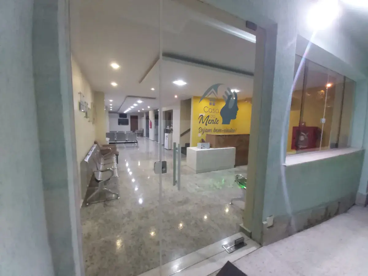
Clínica Casa da Mente — Niterói</strong></p>
             <p>Rua Exemplo, 123 — Icaraí, Niterói / RJ</p>
             <p>CEP: 24230-000</p>
           </address>
           <ul class="location__details" role="list">
             <li>Seg a Sex: 8h às 18h</li>
             <li>Sáb: 8h às 13h</li>
           </ul>
           <a href="tel:+5521987549197" class="btn btn--outline">
             Ligar agora
           </a>
         </div>
         <div class="location__map">
           <iframe
             src="https://www.google.com/maps/embed?..."
             width="100%" height="300"
             style="border:0;" allowfullscreen="" loading="lazy"
             referrerpolicy="no-referrer-when-downgrade"
             title="Mapa — Casa da Mente Niterói"
             aria-label="Mapa de localização da clínica">
           </iframe>
         </div>
       </div>
     </div>
   </section>
   ============================================================ */

.location__grid {
  display: grid;
  grid-template-columns: 1fr;
  gap: var(--space-6);
}

.location__info {
  display: flex;
  flex-direction: column;
  gap: var(--space-5);
}

.location__address {
  font-style: normal;
}

.location__address p {
  font-size: var(--text-base);
  color: var(--color-text-secondary);
  line-height: 1.7;
  margin: 0;
}

.location__address p:first-child {
  color: var(--color-text);
}

.location__details {
  list-style: none;
  display: flex;
  flex-direction: column;
  gap: var(--space-2);
}

.location__details li {
  display: flex;
  align-items: center;
  gap: var(--space-2);
  font-size: var(--text-sm);
  color: var(--color-text-secondary);
}

.location__details li::before {
  content: '';
  display: block;
  width: 6px;
  height: 6px;
  background-color: var(--color-primary);
  border-radius: var(--radius-full);
  flex-shrink: 0;
}

.location__map {
  border-radius: var(--radius-xl);
  overflow: hidden;
  box-shadow: var(--shadow-md);
}

.location__map iframe {
  display: block;
  width: 100%;
  height: 280px;
  border: none;
}


/* ============================================================
   12. COMPONENT: FAQ ACCORDION (CSS-only, sem JavaScript)
   ============================================================

   TÉCNICA: usa <details> / <summary> nativo do HTML.
   Sem JavaScript. Acessível por padrão. Safari/Chrome/Firefox: OK.

   Estrutura HTML:
   <section class="faq section" aria-labelledby="faq-title">
     <div class="container">
       <div class="text-center mb-8">
         <span class="section-label">Dúvidas</span>
         <h2 class="section-title" id="faq-title">
           Perguntas Frequentes sobre EEG em Niterói
         </h2>
       </div>
       <div class="faq__list">
         <details class="faq__item">
           <summary class="faq__question">
             <span>O que é o exame de EEG?</span>
             <svg class="faq__icon" ...></svg>
           </summary>
           <div class="faq__answer">
             <p>O Eletroencefalograma (EEG) é um exame que registra...</p>
           </div>
         </details>
         <!-- repetir para cada pergunta -->
       </div>
     </div>
   </section>
   ============================================================ */

.faq__list {
  display: flex;
  flex-direction: column;
  gap: var(--space-3);
  max-width: 768px;
  margin-inline: auto;
}

.faq__item {
  background-color: var(--color-bg);
  border: 1px solid var(--color-border);
  border-radius: var(--radius-lg);
  overflow: hidden;
  box-shadow: var(--shadow-xs);
  transition: box-shadow var(--transition-base);
}

.faq__item[open] {
  box-shadow: var(--shadow-sm);
  border-color: var(--color-primary);
}

.faq__question {
  display: flex;
  align-items: center;
  justify-content: space-between;
  gap: var(--space-4);
  padding: var(--space-5) var(--space-5);
  cursor: pointer;
  user-select: none;
  list-style: none;
  min-height: var(--tap-min);
  font-family: var(--font-heading);
  font-size: var(--text-base);
  font-weight: var(--weight-semibold);
  color: var(--color-text);
  transition: background-color var(--transition-fast);
}

.faq__question::-webkit-details-marker { display: none; }
.faq__question::marker { display: none; }

.faq__question:hover {
  background-color: var(--color-surface);
}

.faq__question span {
  flex: 1;
  line-height: var(--leading-snug);
}

.faq__icon {
  width: 20px;
  height: 20px;
  flex-shrink: 0;
  color: var(--color-primary);
  transition: transform var(--transition-base);
}

.faq__item[open] .faq__icon {
  transform: rotate(180deg);
}

.faq__answer {
  padding: 0 var(--space-5) var(--space-5);
  border-top: 1px solid var(--color-border-light);
}

.faq__answer p {
  font-size: var(--text-base);
  color: var(--color-text-secondary);
  line-height: var(--leading-relaxed);
  padding-top: var(--space-4);
  margin: 0;
}

.faq__answer p + p {
  margin-top: var(--space-3);
}


/* ============================================================
   13. COMPONENT: CTA FINAL
   ============================================================

   Estrutura HTML:
   <section class="cta-final section--dark section"
            aria-labelledby="cta-final-title">
     <div class="container">
       <div class="cta-final__inner text-center">
         <div class="cta-final__badge">
           <img src="/images/selo-google.png" alt="5.0 — 546 avaliações Google"
                width="160" height="44" loading="lazy">
         </div>
         <h2 class="cta-final__title" id="cta-final-title">
           Agende seu EEG em Niterói agora
         </h2>
         <p class="cta-final__subtitle">
           Atendimento rápido, laudo em 24h, profissionais com RQE.
           Clique e fale com a gente pelo WhatsApp.
         </p>
         <a href="https://wa.me/..." class="btn btn--whatsapp btn--xl"
            target="_blank" rel="noopener">
           <svg ...></svg>
           Agendar pelo WhatsApp
         </a>
         <p class="cta-final__note">
           Seg a Sex 8h–18h | Sáb 8h–13h
         </p>
       </div>
     </div>
   </section>
   ============================================================ */

.cta-final {
  background: linear-gradient(
    135deg,
    var(--color-primary-dark) 0%,
    var(--color-primary) 100%
  );
  position: relative;
  overflow: hidden;
}

/* Textura sutil de fundo */
.cta-final::before {
  content: '';
  position: absolute;
  inset: 0;
  background-image: radial-gradient(
    circle at 20% 80%,
    rgba(200, 151, 42, 0.12) 0%,
    transparent 50%
  );
  pointer-events: none;
}

.cta-final__inner {
  position: relative;
  z-index: 1;
  display: flex;
  flex-direction: column;
  align-items: center;
  gap: var(--space-5);
}

.cta-final__badge img {
  height: 44px;
  width: auto;
  filter: brightness(1.1);
}

.cta-final__title {
  font-size: var(--text-2xl);
  font-weight: var(--weight-extrabold);
  color: var(--color-text-inverse);
  line-height: var(--leading-tight);
  max-width: 22ch;
}

.cta-final__subtitle {
  font-size: var(--text-md);
  color: rgba(255, 255, 255, 0.85);
  line-height: var(--leading-relaxed);
  max-width: 52ch;
  margin: 0;
}

.cta-final__note {
  font-size: var(--text-sm);
  color: rgba(255, 255, 255, 0.65);
  margin: 0;
}


/* ============================================================
   14. COMPONENT: FOOTER
   ============================================================

   Estrutura HTML:
   <footer class="site-footer" role="contentinfo">
     <div class="container">
       <div class="site-footer__inner">
         <div class="site-footer__brand">
           <a href="/" class="site-footer__logo">
             <img src="/images/logo.png" alt="Casa da Mente" width="120" height="34" loading="lazy">
           </a>
           <p>Clínica de EEG e Polissonografia em Niterói e Madureira.</p>
         </div>
         <div class="site-footer__contact">
           <h3>Contato</h3>
           <a href="tel:+5521987549197">(21) 98754-9197</a>
           <a href="https://wa.me/..." target="_blank" rel="noopener">WhatsApp</a>
         </div>
         <div class="site-footer__units">
           <h3>Unidades</h3>
           <p>Niterói — Icaraí</p>
           <p>Madureira — Rio de Janeiro</p>
         </div>
       </div>
       <div class="site-footer__bottom">
         <p>&copy; 2026 Casa da Mente. Todos os direitos reservados.</p>
         <nav aria-label="Links legais">
           <a href="/privacidade">Privacidade</a>
           <a href="/termos">Termos</a>
         </nav>
       </div>
     </div>
   </footer>
   ============================================================ */

.site-footer {
  background-color: #0F3D22;  /* Verde muito escuro — base sólida */
  color: rgba(255, 255, 255, 0.8);
  padding-top: var(--space-12);
  padding-bottom: var(--space-6);
}

.site-footer__inner {
  display: grid;
  grid-template-columns: 1fr;
  gap: var(--space-8);
  padding-bottom: var(--space-8);
  border-bottom: 1px solid rgba(255, 255, 255, 0.1);
}

.site-footer__brand {
  display: flex;
  flex-direction: column;
  gap: var(--space-4);
}

.site-footer__logo img {
  /* Se o logo for escuro, pode usar filter: brightness(0) invert(1) */
  height: 32px;
  width: auto;
  filter: brightness(0) invert(1);
  opacity: 0.9;
}

.site-footer__brand p {
  font-size: var(--text-sm);
  color: rgba(255, 255, 255, 0.87);
  line-height: var(--leading-relaxed);
  max-width: 36ch;
  margin: 0;
}

.site-footer__contact,
.site-footer__units {
  display: flex;
  flex-direction: column;
  gap: var(--space-3);
}

.site-footer__contact h3,
.site-footer__units h3 {
  font-size: var(--text-sm);
  font-weight: var(--weight-bold);
  letter-spacing: 0.08em;
  text-transform: uppercase;
  color: rgba(255, 255, 255, 0.92);
}

.site-footer__contact a {
  font-size: var(--text-base);
  color: rgba(255, 255, 255, 0.8);
  text-decoration: none;
  transition: color var(--transition-fast);
  min-height: var(--tap-min);
  display: inline-flex;
  align-items: center;
}

.site-footer__contact a:hover {
  color: var(--color-text-inverse);
}

.site-footer__units p {
  font-size: var(--text-base);
  color: rgba(255, 255, 255, 0.7);
  line-height: 1.6;
  margin: 0;
}

.site-footer__bottom {
  display: flex;
  flex-direction: column;
  gap: var(--space-3);
  padding-top: var(--space-6);
  align-items: center;
  text-align: center;
}

.site-footer__bottom p {
  font-size: var(--text-xs);
  color: rgba(255, 255, 255, 0.75);
  margin: 0;
}

.site-footer__bottom nav {
  display: flex;
  gap: var(--space-4);
}

.site-footer__bottom nav a {
  font-size: var(--text-xs);
  color: rgba(255, 255, 255, 0.75);
  text-decoration: none;
  transition: color var(--transition-fast);
}

.site-footer__bottom nav a:hover {
  color: rgba(255, 255, 255, 0.8);
}


/* ============================================================
   15. COMPONENT: WHATSAPP FAB (Floating Action Button)
   Visível apenas em mobile — botão fixo no canto inferior direito
   ============================================================

   Estrutura HTML:
   <a href="https://wa.me/5521987549197?text=Ol%C3%A1..."
      class="whatsapp-fab"
      target="_blank" rel="noopener"
      aria-label="Agendar pelo WhatsApp">
     <svg ...></svg>
     <span>Agendar</span>
   </a>
   ============================================================ */

.whatsapp-fab {
  display: flex;
  align-items: center;
  gap: var(--space-2);
  position: fixed;
  bottom: 20px;
  right: 16px;
  z-index: 200;
  background-color: var(--color-whatsapp);
  color: var(--color-whatsapp-text);
  text-decoration: none;
  padding: 14px var(--space-5);
  border-radius: var(--radius-full);
  font-family: var(--font-heading);
  font-size: var(--text-base);
  font-weight: var(--weight-bold);
  box-shadow:
    0 4px 12px rgba(37, 211, 102, 0.5),
    0 2px 4px rgba(0, 0, 0, 0.15);
  min-height: 52px;
  min-width: 52px;
  transition:
    background-color var(--transition-fast),
    box-shadow var(--transition-fast),
    transform var(--transition-fast);
  animation: fab-bounce 3s ease-in-out 2s infinite;
}

.whatsapp-fab:hover,
.whatsapp-fab:focus-visible {
  background-color: var(--color-whatsapp-dark);
  color: var(--color-whatsapp-text);
  box-shadow:
    0 6px 20px rgba(37, 211, 102, 0.6),
    0 2px 8px rgba(0, 0, 0, 0.2);
  transform: translateY(-2px);
}

.whatsapp-fab:active {
  transform: scale(0.96);
}

.whatsapp-fab svg {
  width: 24px;
  height: 24px;
  flex-shrink: 0;
}

/* Pulso sutil para chamar atenção (interrompe após 3 ciclos se usar animation-iteration-count) */
@keyframes fab-bounce {
  0%   { transform: translateY(0); }
  10%  { transform: translateY(-4px); }
  20%  { transform: translateY(0); }
  30%  { transform: translateY(-2px); }
  40%  { transform: translateY(0); }
  100% { transform: translateY(0); }
}

/* Em desktop: o FAB some (o header já tem o botão) */
@media (min-width: 768px) {
  .whatsapp-fab {
    display: none;
  }
}


/* ============================================================
   16. UTILITIES & HELPERS
   ============================================================ */

/* Acessibilidade: skip to content */
.skip-link {
  position: absolute;
  top: -100%;
  left: var(--space-4);
  z-index: 9999;
  background-color: var(--color-primary);
  color: var(--color-text-on-primary);
  padding: var(--space-3) var(--space-5);
  border-radius: var(--radius-md);
  font-weight: var(--weight-bold);
  text-decoration: none;
  transition: top var(--transition-fast);
}

.skip-link:focus {
  top: var(--space-4);
}

/* Visualmente oculto mas acessível para leitores de tela */
.sr-only {
  position: absolute;
  width: 1px;
  height: 1px;
  padding: 0;
  margin: -1px;
  overflow: hidden;
  clip: rect(0, 0, 0, 0);
  white-space: nowrap;
  border-width: 0;
}

/* Linha separadora entre seções */
.section-sep {
  border: none;
  border-top: 1px solid var(--color-border-light);
  margin: 0;
}

/* Pill / Tag */
.tag {
  display: inline-flex;
  align-items: center;
  gap: var(--space-1);
  font-size: var(--text-xs);
  font-weight: var(--weight-semibold);
  padding: 3px var(--space-2);
  border-radius: var(--radius-full);
  background-color: var(--color-surface);
  color: var(--color-primary);
  border: 1px solid var(--color-border);
}

/* Linha de ícone + texto */
.icon-row {
  display: flex;
  align-items: center;
  gap: var(--space-2);
}

.icon-row svg {
  width: 18px;
  height: 18px;
  color: var(--color-primary);
  flex-shrink: 0;
}

/* Lista com ícone de check verde */
.check-list {
  display: flex;
  flex-direction: column;
  gap: var(--space-3);
  list-style: none;
}

.check-list li {
  display: flex;
  align-items: flex-start;
  gap: var(--space-3);
  font-size: var(--text-base);
  color: var(--color-text-secondary);
  line-height: var(--leading-relaxed);
}

.check-list li strong:first-child {
  display: block;
  color: var(--color-heading);
  font-weight: var(--weight-semibold);
  margin-bottom: 2px;
}

.check-list li::before {
  content: '';
  display: block;
  width: 20px;
  height: 20px;
  background-color: var(--color-surface);
  border: 1.5px solid var(--color-primary);
  border-radius: var(--radius-full);
  flex-shrink: 0;
  margin-top: 2px;
  background-image: url("data:image/svg+xml,%3Csvg xmlns='http://www.w3.org/2000/svg' viewBox='0 0 20 20' fill='%231B6B3A'%3E%3Cpath fill-rule='evenodd' d='M16.707 5.293a1 1 0 010 1.414l-8 8a1 1 0 01-1.414 0l-4-4a1 1 0 011.414-1.414L8 12.586l7.293-7.293a1 1 0 011.414 0z' clip-rule='evenodd'/%3E%3C/svg%3E");
  background-size: 14px;
  background-repeat: no-repeat;
  background-position: center;
}

/* Preço em destaque */
.price-block {
  display: flex;
  flex-direction: column;
  gap: var(--space-1);
}

.price-block__label {
  font-size: var(--text-xs);
  font-weight: var(--weight-semibold);
  text-transform: uppercase;
  letter-spacing: 0.08em;
  color: var(--color-text-muted);
}

.price-block__value {
  font-family: var(--font-heading);
  font-size: var(--text-3xl);
  font-weight: var(--weight-extrabold);
  color: var(--color-primary);
  line-height: 1;
}

.price-block__installments {
  font-size: var(--text-sm);
  color: var(--color-text-muted);
}

/* Aviso de não aceitação de convênio */
.no-insurance-note {
  display: inline-flex;
  align-items: center;
  gap: var(--space-2);
  font-size: var(--text-sm);
  color: var(--color-text-muted);
  background-color: var(--color-bg-alt);
  border: 1px solid var(--color-border-light);
  padding: var(--space-2) var(--space-3);
  border-radius: var(--radius-md);
}

/* Bloco de preparação do exame */
.prep-card {
  background-color: var(--color-surface);
  border: 1px solid var(--color-border);
  border-left: 4px solid var(--color-primary);
  border-radius: var(--radius-lg);
  padding: var(--space-5);
}

.prep-card__title {
  font-size: var(--text-base);
  font-weight: var(--weight-bold);
  color: var(--color-primary);
  margin-bottom: var(--space-3);
}


/* ============================================================
   17. MEDIA QUERIES — Mobile First
   ============================================================ */

/* --- sm: 480px — smartphone grande --- */
@media (min-width: 480px) {
  :root {
    --container-pad: var(--space-5);
  }

  .hero__img {
    height: 320px;
  }

  .trust-bar__list {
    grid-template-columns: repeat(2, 1fr);
  }
}

/* --- md: 640px — tablet portrait --- */
@media (min-width: 640px) {
  :root {
    --container-pad: var(--space-6);
  }

  h1 { font-size: var(--text-3xl); }
  h2 { font-size: var(--text-2xl); }

  .section-title {
    font-size: var(--text-3xl);
  }

  .hero__title {
    font-size: var(--text-3xl);
  }

  .hero__img {
    height: 380px;
  }

  .cards-grid {
    grid-template-columns: repeat(2, 1fr);
  }

  .reviews__grid {
    grid-template-columns: repeat(2, 1fr);
  }

  .location__grid {
    grid-template-columns: 1fr 1fr;
    align-items: start;
  }

  .location__map iframe {
    height: 340px;
  }
}

/* --- lg: 768px — tablet landscape / desktop pequeno --- */
@media (min-width: 768px) {
  :root {
    --container-pad: var(--space-8);
    --header-height: 72px;
  }

  h1 { font-size: var(--text-4xl); }

  .section {
    padding-block: var(--space-20);
  }

  .section-title {
    font-size: var(--text-4xl);
  }

  .site-header__tel {
    display: flex;
  }

  .hero {
    padding-top: var(--space-2);
    padding-bottom: var(--space-8);
  }

  .hero__inner {
    grid-template-columns: 1fr 1fr;
    gap: var(--space-12);
  }

  .hero__title {
    font-size: var(--text-4xl);
  }

  .hero__img {
    height: 440px;
  }

  .hero__cta {
    flex-direction: row;
    align-items: center;
  }

  .trust-bar__list {
    grid-template-columns: repeat(4, 1fr);
  }

  .cards-grid {
    grid-template-columns: repeat(2, 1fr);
  }

  .reviews__grid {
    grid-template-columns: repeat(3, 1fr);
  }

  .site-footer__inner {
    grid-template-columns: 2fr 1fr 1fr;
  }

  .site-footer__bottom {
    flex-direction: row;
    justify-content: space-between;
    text-align: left;
  }
}

/* --- xl: 1024px — desktop --- */
@media (min-width: 1024px) {
  h1 { font-size: var(--text-5xl); }

  .hero__title {
    font-size: var(--text-5xl);
  }

  .hero__img {
    height: 500px;
  }

  .cards-grid {
    grid-template-columns: repeat(3, 1fr);
  }

  .location__grid {
    grid-template-columns: 5fr 7fr;
    gap: var(--space-12);
  }

  .location__map iframe {
    height: 400px;
  }

  .cta-final__title {
    font-size: var(--text-4xl);
  }
}

/* --- 2xl: 1280px --- */
@media (min-width: 1280px) {
  :root {
    --container-pad: var(--space-10);
  }
}


/* ============================================================
   UTILITIES DE PERFORMANCE / PRINT / REDUZIDO
   ============================================================ */

/* Usuários que preferem movimento reduzido */
@media (prefers-reduced-motion: reduce) {
  *,
  *::before,
  *::after {
    animation-duration: 0.01ms !important;
    animation-iteration-count: 1 !important;
    transition-duration: 0.01ms !important;
    scroll-behavior: auto !important;
  }
}

/* Print: remover elementos de navegação */
@media print {
  .site-header,
  .whatsapp-fab,
  .cta-final,
  .site-footer__bottom {
    display: none;
  }

  body {
    font-size: 12pt;
    color: #000;
  }

  a[href]::after {
    content: " (" attr(href) ")";
    font-size: 0.8em;
    color: #666;
  }
}
